
Marketing Materials
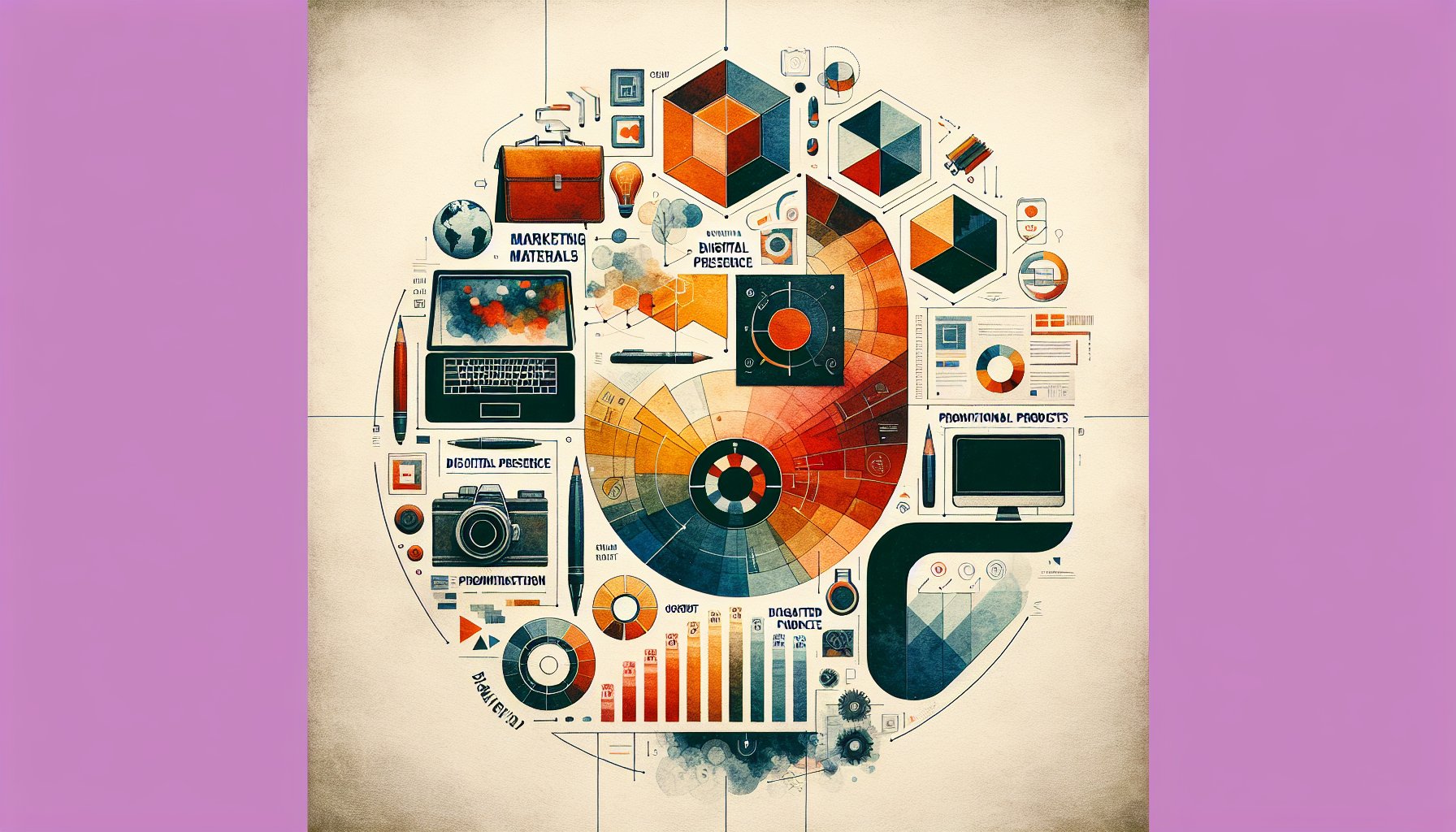
The Ultimate Guide to Designing Eye-Catching Marketing Materials
Unlock the secrets to designing eye-catching marketing materials with our ultimate guide. Explore color psychology, typography, imagery, and more to captivate your audience and enhance brand recognition.
Sep 26, 2025
6 min read
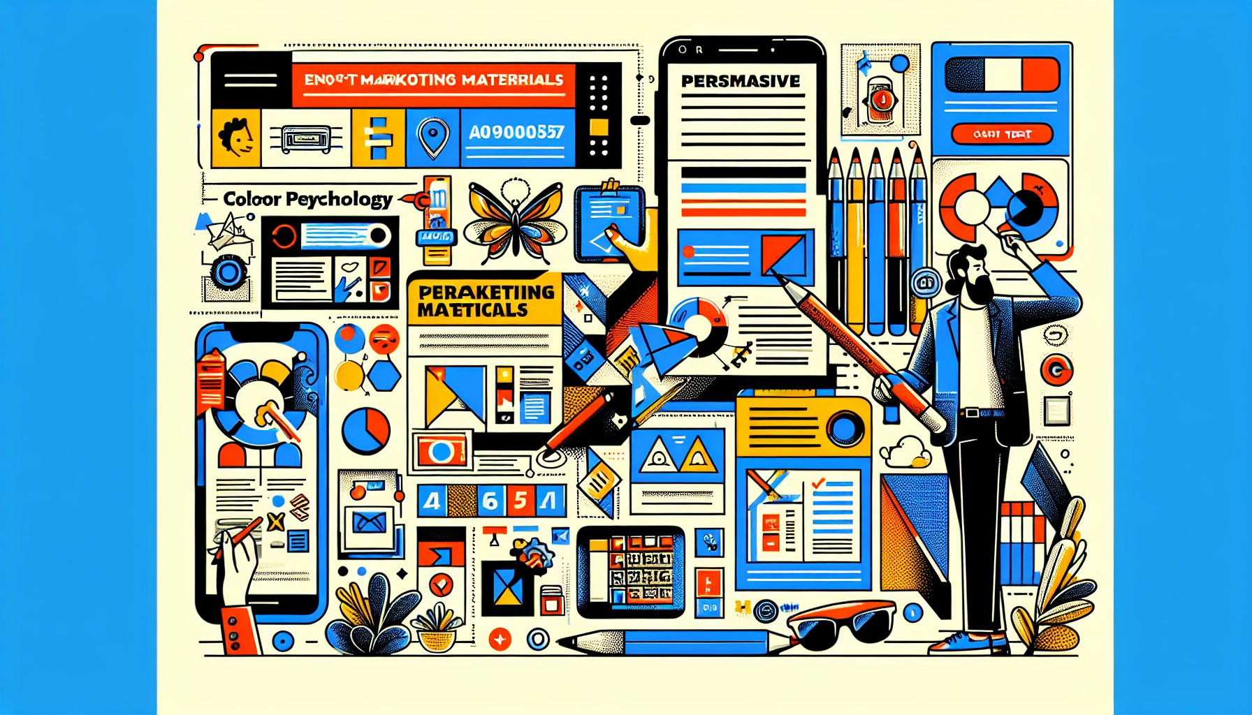
The Ultimate Guide to Designing Eye-Catching Marketing Materials for Proforma Color Press
TL;DR
Designing standout marketing materials requires a mastery of color psychology, typography, imagery, layout, the strategic use of white space, persuasive calls to action, and the tangible allure of print. In today’s digital-first world, these elements must be harmonized across channels to maintain brand coherence. Continuous testing and refinement ensure effectiveness, while embracing future trends in technology, sustainability, and personalization will keep your brand ahead.
1. The Kaleidoscope Effect: The Power of Color
It's more than just a splash on a canvas; color is your first shout-out to the world. It's the siren song that lures customers in, speaks to their emotions, and plants your brand into their minds. So, when you're dreaming up marketing materials, understanding color psychology isn’t merely an artistic flair, it's strategic warfare.
Say you’re a small business with a stall at a local trade show, and you're considering custom printed bags to charm a younger crowd. Electric blues or flashy pinks might be your go-tos. But, if your audience tilts older, perhaps deep greens or classic navies might whisper sophistication and reliability. This isn’t just a game of chance; it's chess. Know your audience and align your colors with your brand’s message.
Whether you’re a health-conscious brand opting for earthy tones to echo sustainability or a tech startup embracing sleek metallics for a futuristic vibe, remember: colors are your brand's ambassadors. They’re not just there to look pretty, they’re there to boost sales, instill trust, and keep consumers coming back for more.
2. Typography Tango: The Dance of Fonts
Typography isn’t just a sidekick to your visuals, it's the lead dancer in the narrative of your brand. Think of it as choreography for the eyes. A playful font might invite families into a café for fun afternoons, while an elegant serif whispers sophistication to potential patrons of an upscale bistro.
Just like dancing, the key to typography is harmony and understanding your audience’s rhythm. A sleek sans-serif might scream innovation to a tech-savvy crowd, while a classic serif nods to tradition and reliability.
But beware the cluttered dance floor, allow your typography to breathe with white space, guiding eyes naturally. This careful balance transforms text from mere information to an evocative story, leaving a resonant impression long after the interaction ends.
3. Imagery That Speaks: Crafting Visual Narratives
Images in marketing aren’t just decorative; they’re your brand’s storytellers. In an age where the visual is king, weaving a narrative through imagery is crucial. Imagine a tote bag adorned with a scene that blends urban energy and serene nature, a perfect tale for an eco-conscious brand seeking to bridge city life and sustainability.
Your images should feel like a natural extension of your brand identity, resonating with your audience. By aligning your visuals with core brand elements, you go beyond "pretty" and touch on evocative storytelling that invites participation, not just observation.
4. Layout Alchemy: From Chaos to Clarity
The art of layout is akin to turning a cacophony into a symphony, it's where chaos finds its harmony. Picture this: a vibrant booth at a trade show, competing for attention. What stands out? A custom printed bag with strategic logo placement and ample breathing room. It's clean, it's concise, and it’s memorable.
Begin with understanding your audience, what engages them and what turns them away. Layer your design elements wisely, your colors, your fonts, your imagery, so they guide the eye smoothly and evoke the right emotion.
5. The Bold and the Beautiful: Embracing White Space
In the bustling realm of marketing, white space is your secret weapon. It’s the pause between notes that gives music its rhythm. Imagine a trade show, where amidst the visual noise, a minimalist bag with ample white space effortlessly draws attention to your vibrant logo. This negative space isn't empty; it's strategic, providing clarity and focus.
Regardless of your audience's age or preference, everyone appreciates a design that feels fresh and uncluttered. Embracing white space in your marketing materials transforms them from functional to captivating, ensuring your brand message is not just seen, but savored.
6. The Art of Persuasion: Call to Action
Turning heads is just the start; getting people to act is where the magic happens. Your call to action (CTA) is the gentle nudge, the whispered invitation to join your brand’s journey. Think beyond “Buy Now!” Aim for CTAs that spark curiosity or excitement, like “Discover the Adventure” or “Join Us for More.”
Balance urgency with authenticity. Consumers can spot inauthentic pitches a mile away. Make sure your offers align with real value, fostering trust and long-lasting relationships.
7. Paper & Print: Beyond the Digital Realm
In a world dominated by screens, the tactile allure of print can set you apart, offering authenticity that digital often lacks. A well-designed paper piece, like a custom printed bag, transcends utility, it becomes a storytelling relic of your brand ethos.
Consider the materials and design choices carefully, ensuring they resonate with your audience. A well-crafted physical item can bridge the gap from mere marketing tool to cherished memory, fostering deeper brand connections.
8. Harmonizing Formats: Cross-Channel Consistency
Inconsistency in branding is like a guitar out of tune, it jars. Your marketing materials should harmonize across channels, ensuring a unified brand voice and visual identity. A tote bag’s vibrant design should echo the energy of your online presence, crafting a seamless experience from screen to tangible touchpoint.
This consistency builds trust and reinforces brand recognition, making your message unmistakable and compelling, wherever it’s encountered.
9. Testing and Tuning: The Iterative Process
Creating impactful marketing materials is an ongoing process of refinement. It’s about learning, adapting, and improving. Prototype, gather feedback, tweak. This cycle ensures your designs hit the mark with your audience, making them not just visually pleasing but also functionally impeccable.
A/B testing can reveal what resonates best, transforming data into actionable insights that enhance your marketing strategy and deepen audience engagement.
10. The Future of Design: Embracing Innovation
Looking ahead, design will be shaped by technology, sustainability, and personalization. AR can turn a simple bag into an interactive experience, while sustainable materials will appeal to eco-conscious consumers. Minimalist designs will continue to convey complex ideas simply and elegantly.
Personalization will be key, allowing consumers to feel seen and valued. By staying ahead of these trends, your marketing materials will not only capture attention but also hold it, fostering deeper connections and lasting brand loyalty.
At Proforma Color Press, we're ready to help you navigate these trends, ensuring your marketing materials are as eye-catching as they are effective. Let's make your brand unforgettable.
Need Help?
Check out these related products that can help:
Other Articles You Will Like

Marketing Materials
How to Create Compelling Marketing Materials That Drive Sales
Discover how to create compelling marketing materials that drive sales. Learn the art of storytelling, design, persuasive copy, and personalized experiences to captivate your audience and boost your brand's success.
Dec 09, 2025
Read More

Marketing Materials
Marketing Materials Uncovered: Strategies for Engaging B2B Audiences
Discover how to captivate B2B audiences with innovative marketing materials. Explore strategies that blend storytelling, design, and analytics for deeper connections and lasting partnerships in 'Marketing Materials Uncovered: Strategies for Engaging B2B Audiences'.
Dec 08, 2025
Read More
Marketing Materials
How to Choose the Right Formats for Your Marketing Materials
Discover essential tips on how to choose the right formats for your marketing materials. From audience insights to sustainability, learn how to craft impactful marketing strategies that resonate and engage.
Dec 08, 2025
Read More
Marketing Materials
Maximize Your Brand: Essential Marketing Materials Every Entrepreneur Needs
Unlock your brand's potential with essential marketing materials every entrepreneur needs. From print power to digital presence, discover strategies to elevate your brand and engage your audience effectively.
Dec 07, 2025
Read More
Marketing Materials
How to Integrate Customer Feedback into Your Marketing Materials
Discover how to integrate customer feedback into your marketing materials to create compelling narratives. Learn strategies for transforming insights into engaging content that resonates with your audience and drives brand loyalty.
Dec 06, 2025
Read More
Marketing Materials
How to Leverage Digital Tools for Stunning Marketing Materials
Discover how to leverage digital tools for stunning marketing materials that captivate your audience. Learn strategies for intentional design, storytelling, and brand consistency to elevate your nonprofit's outreach and drive meaningful change.
Dec 06, 2025
Read More
