
Marketing Materials
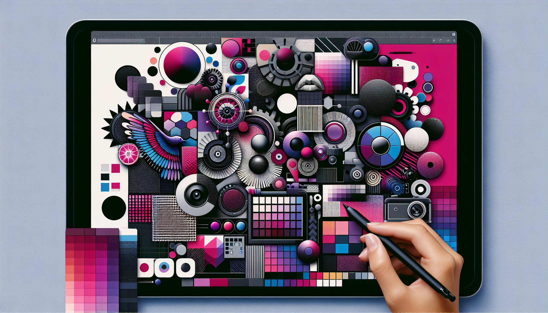
Step-by-Step Guide to Designing Effective Marketing Materials
Unlock the secrets to impactful marketing materials with our step-by-step guide. Learn about brand identity, audience insights, color psychology, and more to create designs that resonate and engage.
Dec 08, 2025
6 min read
Step-by-Step Guide to Designing Effective Marketing Materials
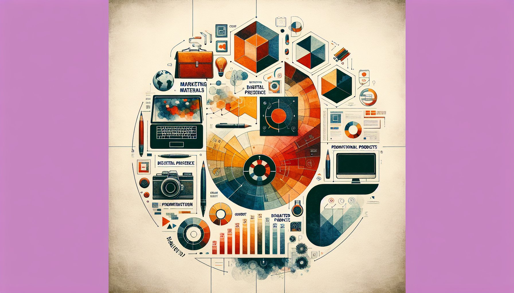
The world of marketing materials can feel like an expansive artistic canvas, awaiting your strokes of genius. In this guide, we'll explore how to transform your ideas into effective marketing masterpieces for Proforma Color Press. We'll delve into understanding brand identity, mapping the target audience, leveraging color psychology, and navigating the technical aspects of design. Each section offers insights into turning creative sparks into cohesive, impactful campaigns.
The Canvas of Possibilities: Understanding Your Brand Identity
Ever feel like your brand is a bit of a mystery to the outside world? It's time to crack that code. Before you dive into the marketing materials frenzy, get cozy with your brand identity, the essence that makes your business tick. Think of your brand as a living, breathing entity, complete with a personality, style, and a unique story. Your brand identity should guide everything, from the colors you choose to the fonts you flaunt. Take Coca-Cola’s iconic branding: it’s not just red and white; it's a nostalgic pop of joy. Embrace brainstorming sessions with your team, because two (or more) heads are better than one, and sketch out what your brand truly stands for. The more defined your brand, the more cohesive your marketing materials will be.
The Audience Adventure
Next stop: understanding your audience like the back of your hand. This isn’t a “one size fits all” journey, it’s more like customizing the perfect playlist for a road trip. Dive deep into the demographics, but don't stop there. Get into the nitty-gritty of your audience's habits, dreams, and challenges. For example, if you’re selling eco-friendly products, recognize that a college student might prioritize cost over sustainability, while a 30-something professional values green ethics. Use surveys, focus groups, and social media analytics to gather data, and turn those insights into personas that bring your audience to life. Continuous feedback ensures your message stays as fresh as a mountain stream.
Color Your World: The Psychology Behind Design Choices
Colors aren’t just pretty pixels; they're emotional catalysts. The right palette can tell a story, evoke feelings, and even nudge behavior. Proforma Color Press knows this dance all too well, leveraging hues to resonate with audiences. Picture this: blue for trust (hello, banks), red for urgency (think flash sales), and green for sustainability. Choosing a color scheme isn’t just about aesthetics; it's about aligning with your audience's psyche. And remember, consistency is key. A consistent color palette across all platforms boosts brand recognition like nothing else.
The Art of Visual Hierarchy: Crafting Eye-Catching Layouts
Visual hierarchy in design is akin to a good novel, drawing readers in and leading them on a journey. Start with size and scale to grab attention; make headlines bold and body text supportive. Colors play their part too; highlight with vibrant hues while letting muted tones provide balance. Don't forget the power of whitespace, it’s the silent pause in your visual symphony. Elements grouped together suggest a relationship, aiding your audience in navigating your narrative with ease.
Typography Tales: Choosing Fonts that Speak Volumes
Typography isn’t just about legible letters; it’s the whisper or shout of your brand's voice. The right font can evoke luxury, innovation, or trust. Know your audience and pick fonts that align with their expectations. Whether crafting an email or a flyer, ensure your typography is readable on all devices. Storytelling through fonts creates an emotional resonance, rounded fonts for compassion, angular ones for authority. Consistency in typography, like using a harmonious blend of design elements, fosters brand recognition.
Imagery Innovation: Sourcing and Utilizing Visual Content
Images can capture the heart faster than words. But finding the perfect visual is the challenge. While stock photos are a go-to, consider unique sources like local talent to make your imagery stand out. Once sourced, integrate images seamlessly into your campaign, letting them tell your story. Avoid overused visuals; instead, opt for authenticity that mirrors your brand’s essence. Platforms like Canva can help you blend imagery with design, maintaining brand cohesion.
Words that Work
Crafting compelling copy is an art form, capable of transforming casual readers into committed customers. Start by understanding your audience intimately, using language that resonates. Clarity trumps complex jargon; compelling narratives connect deeper than dry facts. A strong call to action is your closing argument, make it count. Remember, words aren’t just read; they’re felt, and that’s where the magic happens.
Feedback Loop: Refining through Testing and Iteration
Remember, marketing isn’t a one-and-done deal. The feedback loop is your key to continuous improvement. Gather insights post-launch through surveys and social media insights. Embrace A/B testing to discover what truly resonates. Iteration is about evolution, not just minor tweaks. The feedback loop isn’t just a step; it’s the heartbeat of an ever-improving marketing strategy.
From Pixels to Print: Ensuring Quality Across Formats
Transitioning from digital designs to print is a dance of detail. Make sure your designs are pixel-perfect by adjusting color modes and resolution. Select the right materials to amplify your message, silk-coated paper for luxury, heavy stock for durability. Knowing the technical ropes ensures your vibrant digital masterpiece shines just as bright in print.
The Final Push: Launching and Promoting Your Marketing Materials
You’ve done the hard work; now it's time to launch. Align your marketing materials with your brand's narrative. Tailor your promotional strategies to each platform, paying attention to timing and feedback. Create a dialogue with your audience post-launch to build a community. The final push is about more than just launching, it's about crafting an experience that sticks.
TL;DR
In crafting effective marketing materials, start by understanding your brand identity and audience. Use color psychology and visual hierarchy to draw attention, choose fonts that resonate, and source compelling imagery. Craft copy with clarity and emotion, embrace feedback for iterative improvement, and ensure your designs transition beautifully from pixels to print. Finally, launch with a strategy that ties it all together, engaging your audience and cultivating loyalty.
Need Help?
Check out these related products that can help:
Other Articles You Will Like

Marketing Materials
How to Create Compelling Marketing Materials That Drive Sales
Discover how to create compelling marketing materials that drive sales. Learn the art of storytelling, design, persuasive copy, and personalized experiences to captivate your audience and boost your brand's success.
Dec 09, 2025
Read More

Marketing Materials
Marketing Materials Uncovered: Strategies for Engaging B2B Audiences
Discover how to captivate B2B audiences with innovative marketing materials. Explore strategies that blend storytelling, design, and analytics for deeper connections and lasting partnerships in 'Marketing Materials Uncovered: Strategies for Engaging B2B Audiences'.
Dec 08, 2025
Read More
Marketing Materials
How to Choose the Right Formats for Your Marketing Materials
Discover essential tips on how to choose the right formats for your marketing materials. From audience insights to sustainability, learn how to craft impactful marketing strategies that resonate and engage.
Dec 08, 2025
Read More
Marketing Materials
Maximize Your Brand: Essential Marketing Materials Every Entrepreneur Needs
Unlock your brand's potential with essential marketing materials every entrepreneur needs. From print power to digital presence, discover strategies to elevate your brand and engage your audience effectively.
Dec 07, 2025
Read More
Marketing Materials
How to Integrate Customer Feedback into Your Marketing Materials
Discover how to integrate customer feedback into your marketing materials to create compelling narratives. Learn strategies for transforming insights into engaging content that resonates with your audience and drives brand loyalty.
Dec 06, 2025
Read More
Marketing Materials
How to Leverage Digital Tools for Stunning Marketing Materials
Discover how to leverage digital tools for stunning marketing materials that captivate your audience. Learn strategies for intentional design, storytelling, and brand consistency to elevate your nonprofit's outreach and drive meaningful change.
Dec 06, 2025
Read More
